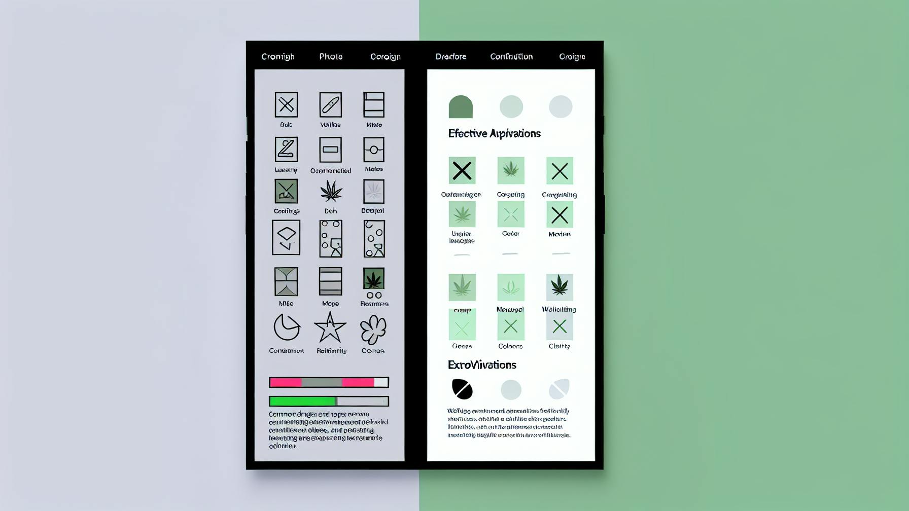
Mobile UX can make or break your cannabis website. Here’s what you need to know:
- 53% of visitors leave if pages take over 3 seconds to load
- 88% won’t return after a bad experience
- Good design can boost conversions by 200%
Top 10 mobile UX mistakes and fixes:
- Skipping user research
- Overcomplicated navigation
- Non-responsive design
- Cluttered screens
- Tiny buttons
- Slow load times
- Poor search function
- Unclear content hierarchy
- Inconsistent design
- Ignoring accessibility
Quick Comparison:
| Mistake | Impact | Fix |
|---|---|---|
| No user research | Misaligned features | Run surveys, focus groups |
| Complex navigation | Users can’t find stuff | Simplify menus, use clear labels |
| Non-responsive | Poor mobile experience | Use responsive design, test on devices |
| Cluttered screens | Confused users | Embrace white space, prioritize content |
| Small buttons | Tap errors | Make buttons 48x48px minimum |
| Slow loads | High bounce rates | Optimize images, use caching |
| Bad search | Frustrated users | Add autocomplete, filters |
| Messy hierarchy | Lost users | Use visual cues, follow F-pattern |
| Inconsistent design | Annoyed users | Create a design system |
| Not accessible | Excludes users | Add alt text, improve contrast |
Fix these issues to boost engagement, sales, and user satisfaction on your cannabis site.
Related video from YouTube
Not Doing User Research
Many cannabis companies skip user research. Big mistake. Without it, you’re just guessing what customers want.
Why user research matters:
- Understand your target market
- Avoid building unwanted features
- Boost conversion rates
Some eye-opening stats:
- 48% of cannabis users consume daily
- 78% say their usage will stay the same or increase next year
These numbers show why knowing your users is crucial.
How to fix this mistake:
1. Run online surveys
Use Google Forms or SurveyMonkey to learn about user preferences and needs.
2. Conduct focus groups
Get a small group of cannabis users together. Ask for their thoughts on your product or website. You’ll get insights you might otherwise miss.
3. Analyze competitors
Check out what other cannabis companies are doing. Spot gaps in the market.
4. Use online analytics
Google Analytics can show how people use your website. Let this data guide your design decisions.
Real-world example: A cannabis market research study gathered feedback from 417 recreational and medical users. They focused on preferences and consumption methods. This kind of data is gold for improving mobile UX.
"Design without research means that the product won’t meet the needs of the people who use it. Researching without design means that the insights may not get implemented at all." – Nicolo Arena and Caroline Wilcock, Product Designer and User Researcher
Don’t guess. Research. Your cannabis business will thank you.
2. Making Navigation Too Complex
Cannabis apps and websites often mess up their navigation. It’s a big problem that can drive users away.
Why does simple navigation matter? Here’s the deal:
- 1 in 4 users ditch an app after trying it once
- Messy menus are a nightmare on small screens
- Bad navigation = users can’t find stuff
So, how do we fix it? Let’s break it down:
1. Cut down menu options
Stick to 5-7 main categories. Don’t list every single product type. Instead, go broad: "Flower", "Edibles", "Concentrates". Done.
2. Use plain English
Ditch the fancy weed lingo. Keep it simple. "Shop" beats "Product Catalog" any day.
3. Think thumbs
Put important stuff where thumbs can reach. It’s called the "thumb rule" for a reason.
4. Add search
Help people find what they want, fast. A search bar can be a lifesaver.
5. Highlight what matters
Put the important stuff front and center. Make that "Order Now" button pop.
| What | Where | Why |
|---|---|---|
| Main menu | Bottom | Easy to reach |
| Search | Top | Quick finds |
| Order button | Center/bottom right | Get clicks |
Keep it simple, and users will stick around. That means more sales for your cannabis biz.
"If it takes more than 2-3 clicks to find something, your design needs work." – Abdul Suleiman, Chief Experience Officer
3. Forgetting About Mobile Responsiveness
In 2024, mobile-friendly design is a MUST. Over half of web traffic comes from mobile devices. For cannabis businesses, it’s adapt or lose customers.
Why mobile matters:
- 52.2% of website traffic was mobile in 2018 (Statista)
- Google favors mobile-friendly sites in rankings
- Users bounce fast from clunky mobile sites
How to fix it:
1. Go responsive
Use CSS to make your site adjust to any screen size. One site, all devices.
2. Simplify navigation
Cut menu options. Use a hamburger menu for mobile. Put key links where thumbs can reach.
3. Speed it up
Optimize images, cut large files. Mobile users hate slow loads.
4. Make it readable
Use legible fonts and sizes. No squinting allowed.
5. Test, test, test
Check your site on different devices and browsers. What works on your phone might not on others.
| Mobile Design Element | Why It Matters | How to Implement |
|---|---|---|
| Responsive layout | Fits all screens | Use fluid grids and flexible images |
| Simple navigation | Easy to use | Hamburger menus, limit options |
| Fast load times | Keeps users on site | Optimize images, minimize large files |
| Readable text | No zooming needed | Use 16px font size minimum |
| Touch-friendly buttons | Prevents mis-clicks | Buttons at least 44×44 pixels |
Mobile users are on the go. They need quick, easy access to your products and info. A clunky mobile site = lost sales.
"If your site isn’t mobile-friendly in 2024, you’re essentially turning away customers at the door." – Google’s Mobile-First Indexing Announcement
4. Crowding the Screen
Ever tried to read a book through a keyhole? That’s what a cluttered mobile screen feels like for cannabis shoppers.
Many dispensaries stuff their sites like an overpacked bowl. The result? Users get lost in the haze.
Here’s the deal:
- Too much stuff = confused users
- Confused users = quick exits
- Quick exits = lost sales
So, how do we clear the smoke?
Keep it simple, stoner
1. Embrace the void
White space isn’t lazy design. It’s breathing room for your content. Check out Coastal:
"Coastal’s homepage? Clean as a whistle. Products pop, cart’s a cinch. Scrolling feels like a smooth hit."
2. Play eye tour guide
Lead users to the good stuff. Urbn Leaf nails this:
"Urbn Leaf’s site? A visual buffet. Categories? Clear as day. Images do the heavy lifting."
3. Marie Kondo that content
If it doesn’t spark joy (or sales), it’s gotta go. Mosaic‘s app gets it:
"Mosaic’s app? Lean and mean. Specials or menu – pick your path. No fluff, all stuff you need."
4. Make navigation a no-brainer
Users should flow through your site like smooth smoke. Stick to what works: hamburger menus, limited options.
5. Size matters
Buttons too small? That’s a buzz kill. Aim for 44×44 pixels minimum. Your users’ fingers will thank you.
Remember: A clear screen leads to green. Keep it simple, and watch those sales roll in.
5. Using Buttons That Are Too Small
Tiny buttons on mobile apps? It’s like trying to thread a needle while riding a rollercoaster. Not fun, especially for cannabis app users who might be… less than precise.
Why small buttons are a problem:
- Hard to tap
- Slow users down
- Cause errors
Here’s the deal: Your thumb is about 72 pixels wide on most screens. But many apps use buttons way smaller than that.
So, what size should buttons be?
| Button Priority | Size (pixels) |
|---|---|
| High | 72 |
| Medium | 60 |
| Low | 42 |
Anything under 42 pixels? You’re asking for trouble.
Take the Glow Baby app. They had a button smaller than a grain of rice for short nursing sessions. Users couldn’t tap it, leading to frustration and wrong data.
How to fix it:
1. Make buttons bigger: Aim for at least 48×48 pixels. That’s what Android’s Material Design suggests.
2. Space them out: Leave 8 pixels between buttons. Don’t crowd them.
3. Bottom is best: Put important buttons at the screen’s bottom. Easier to reach with your thumb.
4. Extend the tap area: Make the tappable area bigger than the visible button.
5. Test with real users: What looks good on your big screen might be a nightmare on a small phone.
Remember: Good button design is like good pizza – it should be easy to grab and satisfying to use.
sbb-itb-430f9b7
6. Having Slow Load Times
Slow websites are a buzzkill. In today’s mobile-first world, speed is everything. Here’s why slow load times hurt and how to fix them:
Why Slow is a No-Go
- Over half of mobile users bail if a site takes more than 3 seconds to load
- Google might demote your site in search results
- Frustrated users often don’t come back
Speed It Up
1. Cut the Clutter
Remove unnecessary elements. Each item on your page is extra baggage.
2. Shrink Images
Use WebP format. It can reduce image size by 30% without quality loss.
3. Use Browser Caching
This simple trick can cut load times by up to 2 seconds.
4. Reduce HTTP Requests
Combine CSS and JavaScript files to minimize server calls.
5. Try a CDN
Content Delivery Networks spread your content across servers, speeding things up.
Real Results
"We slashed loading time from 24.69 to 2.44 seconds, cut requests from 280 to 23, and improved time to first byte from 8.03 to 0.26 seconds on one project."
Google’s Speed Scorecard
| Metric | Good | Average | Bad |
|---|---|---|---|
| First Contentful Paint | 0-1.8s | 1.8-3s | >3s |
| Largest Contentful Paint | 0-2.5s | 2.5-4s | >4s |
| Time to Interactive | 0-3.8s | 3.8-7.2s | >7.2s |
7. Poor Search Function
A bad search feature can ruin your mobile app. Here’s why it matters and how to fix it:
Why Search Matters
Users love search. 43% head straight for the search box when they visit a site. But if it’s slow or inaccurate? They’ll bail. Fast.
For eCommerce, that’s a $300 billion problem.
Fix Your Mobile Search
1. Make It Easy to Find
Put your search bar where users expect it. If search is key, use a full-width bar up top. Otherwise, bottom navigation works.
2. Speed It Up
Slow searches = frustrated users. Optimize with:
- Smart indexing
- Clever caching
- AI-powered algorithms
3. Add Smart Features
| Feature | What It Does |
|---|---|
| Autocomplete | Suggests as you type |
| Typo tolerance | Handles fat-finger mistakes |
| Synonym recognition | Gets what you mean |
4. Use Hint Text
Guide users on what to search for. Fewer "no results" = happier users.
5. Add Filters
Let users narrow down results. Crucial for apps with tons of stuff.
Who Does It Right?
- Spotify keeps it simple: just albums and songs
- Google Play mixes instant results with suggestions
- Yelp lets you filter after searching
Fix your search, and watch your users stick around.
8. Unclear Content Hierarchy
A messy content hierarchy can turn your mobile app into a confusing labyrinth. Here’s how to fix it:
The Problem
When everything looks the same, nothing stands out. This leads to:
- Lost users
- Slow task completion
- High bounce rates
Users typically spend just 15 seconds deciding if content is relevant. With a jumbled hierarchy, you’re losing them fast.
How to Fix It
1. Map Your Content
Rank your content before designing:
| Priority | Content Type | Example |
|---|---|---|
| 1 | Must-have | Product name, price |
| 2 | Should-have | Features, specs |
| 3 | Nice-to-have | Related products |
2. Use Visual Cues
Guide users with:
- Font size: Bigger = more important
- Color: Contrast for key elements
- Spacing: Group related items
3. Follow the F-Pattern
Users scan in an F-shape on mobile. Put key info top-left, use headings down the left side.
4. Chunk Your Content
Break text into bite-sized pieces:
- Short paragraphs
- Bullet points
- Clear subheadings
Real-World Example
VIA Rail‘s rewards page is a mess. No clear sections, no visual hierarchy, just a wall of text.
Airbnb‘s mobile app does it right:
- Big, clear headings
- Grouped info (price, rating, location)
- Visual separation between listings
Fix your content hierarchy, and you’ll see more engagement, faster task completion, and higher conversion rates.
9. Inconsistent Design
Inconsistent design is a UX nightmare. It’s like trying to read a book where every page uses a different font. Let’s dive into this problem and how to solve it.
The Problem
Imagine using an app where buttons keep moving around. Frustrating, right? That’s what inconsistent design does:
- Screens look like they’re from different apps
- Buttons and icons play hide-and-seek
- Text sizes and fonts are all over the place
The result? Users get annoyed and might ditch your app.
How to Fix It
1. Create a Design System
Think of a design system as your app’s style bible. It keeps everything in check:
| Element | What It Is | Example |
|---|---|---|
| Colors | Your brand’s palette | Main: #FF5733, Accent: #33FF57 |
| Fonts | Text styles | Headers: Roboto 18pt, Body: Arial 14pt |
| Icons | Consistent symbols | Material Design icons |
| Spacing | Element gaps | Margins: 16px, Padding: 8px |
2. Use Style Guides
Make a guide that shows how to use your design system. It’s like a cookbook for your app’s look.
3. Test Across Devices
Don’t forget to check your app on different gadgets. It should look good on all screens.
4. Stick to Platform Guidelines
Follow iOS or Android rules. It makes your app feel at home on each system.
Real-World Example
Strava, the fitness app, messed up. Their mobile app is black and orange, but their website looks totally different. It’s like walking into a store you know, but everything’s been rearranged.
To fix this, Strava should:
- Use the same colors everywhere
- Keep menus in the same spots
- Use matching icons across devices
10. Ignoring Accessibility
Think accessibility is just a nice extra? Think again. It’s a must-have for mobile UX in the cannabis industry.
The Problem
By skipping accessibility, you’re locking out a massive market. In the U.S., 61 million adults have a disability. That’s a lot of potential customers left in the dark.
And it’s not just about disabilities. As we get older, we all need more accessible design. Here’s a kicker: Baby Boomers control 70% of all disposable income in the U.S. Can your business afford to ignore that?
How to Fix It
1. Run an Accessibility Audit
Use tools like WAVE or Lighthouse. They’ll catch issues you might miss.
2. Make It Keyboard-Friendly
Not everyone uses a mouse. Make sure your site works with just a keyboard.
3. Boost Contrast
Low contrast is a no-go. Aim for a contrast ratio of at least 4.5:1 for normal text.
4. Add Alt Text
Screen readers need this to describe images to users who can’t see them.
5. Caption Your Videos
This helps deaf users and anyone watching without sound.
Real-World Impact
In January 2024, Housing Works got hit with a $50,000 lawsuit for an ADA non-compliant site. They had to fix screen reader and navigation issues.
But it’s not all doom and gloom. Companies doing it right are reaping benefits. Uber added VoiceOver support and high-contrast colors. Bank of America‘s mobile app now has customizable text sizes and voice-guided navigation.
Quick Accessibility Checklist
| Feature | Why It Matters | How to Implement |
|---|---|---|
| Alt Text | Helps screen readers describe images | Add descriptive text to all images |
| Keyboard Navigation | Allows use without a mouse | Ensure all interactive elements work with keyboard |
| Color Contrast | Makes text readable | Use tools to check contrast ratios |
| Captions | Helps deaf users and those in noisy environments | Add captions to all video content |
| Scalable Text | Helps users with visual impairments | Allow text to be resized without breaking layout |
Conclusion
Mobile UX in cannabis isn’t just about looks—it’s about making customers’ lives easier. If your app is a pain, users will bail fast.
Here’s what matters:
1. User research is key
Don’t guess. Ask your customers what they want. Leafly surveys users regularly to improve their app. This led to 30% more engagement in 2023.
2. Simple and fast wins
Clutter and slow loads kill conversions. Weedmaps cut checkout steps from 7 to 3. Result? 25% more completed orders.
3. Make it accessible
Remember Housing Works’ $50k ADA lawsuit? Don’t be them. Make your app work for everyone.
4. Keep improving
Cannabis moves fast. Your UX should too. Eaze tests their app every two weeks. It’s why they have a 4.9-star App Store rating.
Bottom line: Great mobile UX in cannabis isn’t optional—it’s essential. It turns visitors into loyal customers.
Zach Santarsiero, VP Digital Marketing at CMO, says:
"Treat your website as an extension of the customer service you provide in person, and you’ll do just fine."
Take these lessons to heart. Your users (and profits) will thank you.


