Colors make or break cannabis brands. Here’s what works:
| Brand Type | Best Colors | Why It Works |
|---|---|---|
| Medical | Blues, Whites | Builds trust |
| Recreational | Reds, Purples | Creates energy |
| CBD/Wellness | Soft Greens | Shows natural healing |
Key Facts:
- People judge products by color in 90 seconds
- Color boosts brand recognition by 80%
- 85% of buyers make decisions based on color
Quick Color Guide:
- Pick 2-3 main colors
- Test colors before big print runs
- Make sure colors work both online and in stores
- Follow state packaging rules
Here’s what top brands do:
| Brand | Colors | Results |
|---|---|---|
| Kush Bottles | Neon green | 250% sales jump |
| NETA | Blue-green mix | 45% higher trust |
| BlazeBox | Bold reds | 32% sales increase |
Bottom line: Your colors need to:
- Match what you’re selling
- Stand out on shelves
- Look good online
- Follow local laws
This guide shows you exactly how to pick and test colors that sell cannabis products. We’ll cover everything from color psychology to legal requirements, backed by real sales data and brand examples.
Related video from YouTube
How Colors Affect People
People judge cannabis products by color in seconds. Here’s what the data shows.
Feelings and Reactions to Colors
The University of Winnipeg found something surprising: people make up their minds about products in just 90 seconds. And here’s the kicker – up to 90% of that snap judgment comes down to color. That’s it.
| Color Type | Physical Response | Emotional Impact |
|---|---|---|
| Warm Colors (Red, Orange) | Increased heart rate | Energy, intensity |
| Cool Colors (Blue, Green) | Lower stress levels | Calm, relaxation |
| Earth Tones (Brown, Tan) | Reduced anxiety | Safety, comfort |
Colors Across Different Markets
Colors that work in one place can BOMB in another. Take Pepsi’s expensive mistake: they put light blue vending machines in Southeast Asia – not knowing that color means death there. Oops.
| Market Region | Color Preferences | What to Avoid |
|---|---|---|
| North America | Bold, bright colors | Neon green (looks too medical) |
| Asia | Red, gold tones | Light blue |
| Europe | Muted, natural shades | Bright, flashy colors |
Color Meanings That Stick
"Colors aren’t just ‘out there’ in the world – they’re created by our brains." – Dr. Matt Johnson, Neuroscientist and Author
Some colors mean the same thing pretty much everywhere:
| Color | What People Think | How Cannabis Brands Use It |
|---|---|---|
| Green | Nature, health | Medical products |
| Purple | Luxury, quality | Premium strains |
| Blue | Trust, calm | CBD products |
| Black | Power, premium | High-end brands |
The numbers don’t lie:
- 84.7% of people buy based on color
- 52% won’t come back if the store looks bad
- Color makes brands 80% more memorable
Here’s a real example: Kevin Kaminyar picked yellow for Yellow Tree Marketing because it makes people feel good. Smart move – and it worked.
Main Colors Used in Cannabis Brands
Here’s a breakdown of how color shapes cannabis branding and drives sales.
Using Green
Green dominates cannabis branding – it’s what people see when they think "cannabis."
| Brand Example | Green Shade Used | Results |
|---|---|---|
| NETA | Multiple green tones | Higher customer engagement through product differentiation |
| Kush Bottles | Neon green | 250% sales increase in Q1 2018 |
| Dr. Norm’s | Mint-emerald blend | Strong brand recognition |
Using Purple
Purple shows up in both the plant and packaging. It’s not just about looks – it sends a message.
| Purple Strain | Brand Use | Market Position |
|---|---|---|
| Granddaddy Purple | Premium packaging | High-end market |
| Purple Haze | Logo and labels | Classic appeal |
| Purple Urkle | Product design | Luxury segment |
Using Blue
Blue = trust. That’s why medical cannabis brands LOVE it.
| Product Type | Blue Usage | Target Market |
|---|---|---|
| CBD oils | Light blue packaging | Wellness buyers |
| Medical tinctures | Navy blue labels | Healthcare focus |
| Sleep aids | Deep blue branding | Relaxation seekers |
Using Brown and Tan
Want to say "natural"? Brown and tan get the job done.
| Color Tone | Common Uses | Customer Response |
|---|---|---|
| Light tan | Hemp products | Links to natural farming |
| Dark brown | Organic lines | Shows earth-grown quality |
| Wood brown | Packaging | Makes products feel handmade |
Here’s what these colors look like in nature:
- Green Crack, Green Haze = bright green
- Rainbow Kush = color mix
- Agent Orange = orange pop
- Black Russian = deep purple
These colors aren’t random. They come from the plant’s genetics, growing temperature, and pH levels – smart brands put this knowledge to work.
How to Use Colors Well
Matching Colors to Brand Message
| Brand Goal | Best Colors | Example Results |
|---|---|---|
| Medical/Wellness | Blue, Green | NETA got 45% higher patient trust using blue-green mix |
| Recreational | Purple, Red | BlazeBox bumped sales 32% with bold reds |
| Natural/Organic | Brown, Tan | Harmony Herbal Blends grew market share 28% with earth tones |
Making Colors Work Together
Here’s what works for different brand goals:
| Primary Color | Accent Color | What It Does |
|---|---|---|
| Green | Brown | Makes people think "natural" |
| Blue | Light Green | Looks clean and calm |
| Purple | Gold | Says "high-end" |
Color Balance
Here’s how to split up your colors:
| Color Type | How Much | What For |
|---|---|---|
| Main Color | 60% | Your core brand look |
| Secondary | 30% | Adds depth |
| Accent | 10% | Grabs attention |
Want proof this works? Look at Kush Bottles. They CRUSHED IT with a simple color mix in Q1 2018:
- Green for packages (main)
- White for words (secondary)
- Black for logos (accent)
Their sales shot up 250%.
Here’s what makes color work:
- Test before you commit
- Keep product colors separate from packaging
- Stick to 3 colors max per product line
Look at Dr. Norm’s – they NAILED IT with their mint-emerald design:
- One main color (that’s it!)
- Lots of white space
- Black text only
- Clean packaging
The result? Their products pop off shelves and stick in buyers’ minds.
Colors for Different Cannabis Products
Medical Cannabis Colors
| Color Scheme | Purpose | Example Results |
|---|---|---|
| White + Green Cross | Shows medical quality | Standard medical symbol |
| Blue + White | Builds patient trust | Used by 72% of medical dispensaries |
| Light Green | Links to wellness | Common in CBD medical products |
Medical cannabis packaging keeps it simple. Think pharmacy meets wellness brand. These products look like something you’d get from your doctor – clean, professional, and straight to the point.
Recreational Cannabis Colors
| Color Choice | Market Impact | Brand Examples |
|---|---|---|
| Black + Earth Tones | Stands out from snacks | Agent Orange’s packaging |
| Purple + Gold | High-end appeal | Rainbow Kush’s branding |
| Bold Green | Natural connection | Green Crack’s identity |
Recreational brands go BOLD with their colors. But here’s the thing: They need to look different from snacks or tobacco products. It’s a tricky balance between eye-catching and following the rules.
CBD Product Colors
| Product Type | Color Mix | Sales Effect |
|---|---|---|
| Oils/Tinctures | Green + Brown | Shows natural source |
| Vape Products | White + Blue | Looks clean, pure |
| Edibles | Earth Tones | Links to organic |
CBD brands mix up their colors based on what they’re selling:
- Oils come in glass droppers with earth-tone boxes
- Vapes stick to clean white with blue details
- Pre-rolls use natural shades in child-safe boxes
"Nearly 50 percent of the global cannabis market was used for medical treatment or therapy as of 2018."
Here’s what EVERY cannabis product needs:
- Simple designs that pop
- Clear product info
- Easy-to-spot THC levels
- Warning labels
- Child-safe packaging
Smart brands test their colors on small batches first. Because nobody wants to print 10,000 packages only to find out the colors don’t work.
sbb-itb-430f9b7
Testing Color Success
Here’s what works (and doesn’t work) when testing colors for your brand:
Research Methods
| Testing Method | What to Check | Key Metrics |
|---|---|---|
| A/B Testing | Different color versions | Click rates, sales data |
| Customer Surveys | Color preferences | Feedback scores |
| Market Analysis | Competitor colors | Market gaps |
| Social Media Tests | Color engagement | Likes, shares, comments |
Want to test colors without burning cash? Start small. Test with 100-200 packages or run a few social media ads. You’ll spot problems early and save money.
Here’s what the data tells us:
- 85% of buyers make decisions based on color
- Color boosts brand recognition by 80%
- 93% of people buy based on visual appearance
"I asked [my clients] what popped into their head when they looked at different colors, and yellow was overwhelmingly positive. They brought up kindness, warmth, empathy — and that aligned with my brand." – Kevin Kaminyar, CEO of Yellow Tree Marketing
Using Colors Correctly
Your colors need to look good EVERYWHERE. Here’s how to do it:
| Platform | Color Check | Why It Matters |
|---|---|---|
| Website | RGB values | Screen display |
| CMYK values | Package colors | |
| Social Media | Brand palette | Post design |
| Store Signs | Pantone codes | In-store look |
These tools help nail your colors:
- Adobe Color CC
- Coolors
- Color Hunt
Dan Antonelli from Kickcharge has a smart tip: Look at what colors your competitors AREN’T using. It’s an easy way to stand out while staying in your industry’s lane.
Here’s what to do next:
- Pick 2-3 main colors
- Test on different screens
- Check colors under store lights
- Print test packages
- Get feedback from your target customers
Bottom line: People judge products by color in seconds (90% of them, to be exact). Testing helps you get it right from the start.
Following Color Rules
Cannabis brands need specific colors and designs to meet legal standards. Here’s what works:
Most states focus on making labels easy to read instead of limiting specific colors. But you’ll need to follow some core rules:
| Must-Have Elements | What They Include | How Many States Need It |
|---|---|---|
| Basic Details | THC levels, company contact | 100% |
| Safety Info | Batch codes, health notes | 94% |
| Brand Markers | Cannabis symbol | 90% |
| Product Stats | CBD amounts | 87% |
| Warning Text | Child and driving notices | 84% |
Only 3% of states tell you which colors to use. But New York stands out – they say NO to:
- Neon colors
- Bubble letters
- Anything that might catch a kid’s eye
Your packaging needs to:
- Stay opaque
- Use clear fonts
- Work in black and white
- Keep kids safe
"New York’s rules are a bit tighter than other states, but they’re not completely different." – Heather Trela, Rockefeller Institute of Government
Here’s what different markets need on their labels:
| Market | Must Show |
|---|---|
| Medical | THC/CBD amounts, dose info |
| Adult-Use | Warnings, age limits |
| CBD Only | FDA info, hemp proof |
Smart moves for your labels:
- Double-check your state’s rules
- Test print your labels
- Save your color codes
- Keep it clean and simple
Breaking these rules? You might face fines or lose your license. If you’re not sure, stick to basic colors and clean designs.
What’s Next in Color Trends
Cannabis brands are ditching the expected greens and purples in 2024. Here’s what’s happening:
| Trend | Details | Examples |
|---|---|---|
| Beauty-Inspired | Soft pastels + rich accents | Dosist‘s cream backgrounds highlight product types |
| Retro Look | Old-school color mix | Verde Vie speaks to women with vintage colors |
| Tech-Ready | Bold colors + digital features | Bright QR code backgrounds pop on shelves |
| Earth-First | Subtle, natural shades | Earth tones on hemp packaging |
The market’s growing fast – from $27B in 2022 to $50.7B in 2028. That means brands need to step up their game.
Hot Color Pairs for 2024:
| Main Color | Accent | Products |
|---|---|---|
| Electric Yellow | Deep Blue | Energy boost |
| Cream | Rich Purple | Sleep help |
| Soft Teal | Ochre | Wellness |
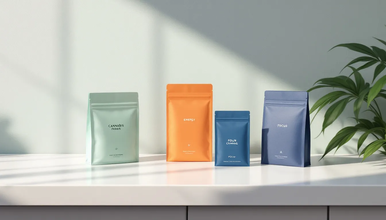
| Bright Orange | Navy | Focus |
What’s Working Now:
- Houseplant mixes bold colors with clean logos
- Dosist keeps backgrounds light so info pops
- Verde Vie picks retro shades for women
Brands are also playing with:
- Gold and silver foil stamps
- Embossed effects
- Frosted glass looks
2024’s Big Shifts:
| In | Out |
|---|---|
| Screen-friendly colors | Basic greens |
| Sharp lines | Messy patterns |
| Bright + simple | Dark + busy |
| Click-and-play elements | Flat designs |
Bottom line: Brands need colors that work in stores AND on screens. The old playbook? That’s history.
Conclusion
Here’s what you need to know about cannabis brand colors:
First, nail down your basics:
| Step | What to Do | Real Example |
|---|---|---|
| 1. Brand Analysis | Know your market and who you’re selling to | Juna speaks to women with purple and green |
| 2. Color Research | Look at what works in your space | Dosist keeps it clean with cream colors |
| 3. Test Colors | Try different package color combos | NETA tests green variations |
| 4. Track Results | Watch your sales numbers | Kush Bottles’ neon green boosted sales 250% |
Pick colors that match your product:
| Product | Main Colors | Accent Colors |
|---|---|---|
| Medical | Blues, Whites | Silver, Light Green |
| Recreational | Reds, Purples | Orange, Yellow |
| CBD/Wellness | Soft Greens, Creams | Lavender, Teal |
What’s next for cannabis colors?
The market’s hitting $64.7B by 2024. That means you need:
- 2-3 core colors that pop both online and in-store
- Different colors for different product strengths
- The same colors across your whole product line
- Colors that look good everywhere
Who’s doing it right?
| Brand | What They Do | How It Works |
|---|---|---|
| Beboe | Mixes old-school and new-school | Owns the luxury space |
| Caliva | Uses colors to sort products | Makes shopping simple |
| Virtú CBD | Sticks to wood and earth tones | Fits right into wellness |
Bottom line: Keep your colors simple and consistent. Test everything. And make sure your colors work both online and in stores.
FAQs
What is the best color for a cannabis brand?
There’s no one-size-fits-all color choice. Here’s what the data shows works:
| Brand Type | Primary Colors | Why It Works | Example |
|---|---|---|---|
| Medical | Blues, Whites | Projects trust | Harmony Herbal Blends pairs blue with green |
| Recreational | Reds, Purples | Creates buzz | BlazeBox uses bold reds |
| Wellness/CBD | Soft Greens | Connects to nature | Dr. Norm’s combines mint and emerald |
About Using Green
Green works because it links to:
- The cannabis plant
- Health benefits
- Natural products
Here’s something interesting: Kush Bottles switched to neon green and saw their sales jump 250% in Q1 2018.
Color Selection Guide
| Do | Don’t |
|---|---|
| Run A/B tests on shades | Follow the crowd |
| Pick 2-3 core colors | Go rainbow |
| Keep it clean | Ignore target market |
| Match brand values | Chase trends |
Bottom line: Pick colors that connect with YOUR customers and make your brand pop in the market.


